
 Crawvix Editorial Team
· Published October 28, 2026 · Last updated November 1, 2026 · 10 min read
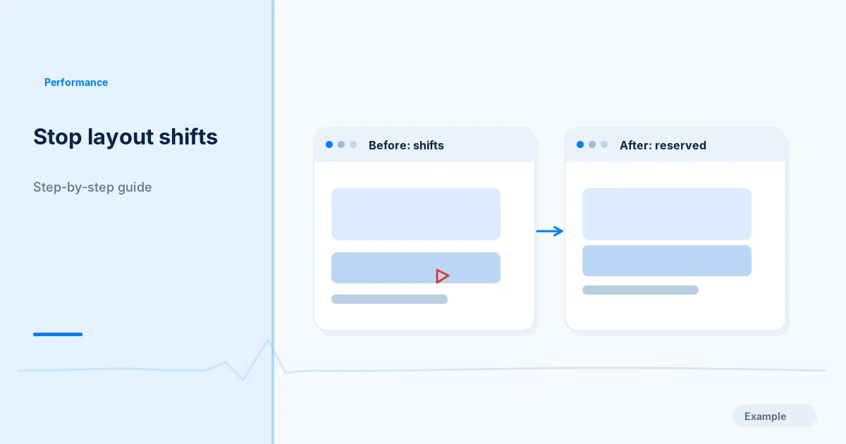
You start reading a paragraph, an image finishes loading above it, and the text drops out from under your eyes. Or you reach for a button and a banner slides in, so your tap lands on something else. That movement is layout shift, and Cumulative Layout Shift (CLS) is the Core Web Vitals metric that scores it. A lower number means a steadier page.
This guide is the practical fix. It finds the elements that move, then removes each cause in turn: images, embeds, ads, banners, late-inserted content, fonts and animations. To understand how the score is calculated and what the thresholds mean, read What Is CLS in Core Web Vitals? first or afterwards.
The principle behind every fix is the same. The browser lays out a page using what it knows at that moment. If something arrives later and its size was unknown, everything after it is pushed. So tell the browser the size early, or place late content where it cannot push anything.
Before you begin
You will need access to the site's templates or theme, a list of your most important public URLs, and a Chromium-based browser such as Chrome or Edge, because the tools below live there. Copy any template or stylesheet before editing it. Pick one test URL per page type (home page, article, listing, product, form), because shifts usually belong to a template rather than to a single page.
A passing result means the measured condition improved. It does not mean Google will rank or index the page differently.
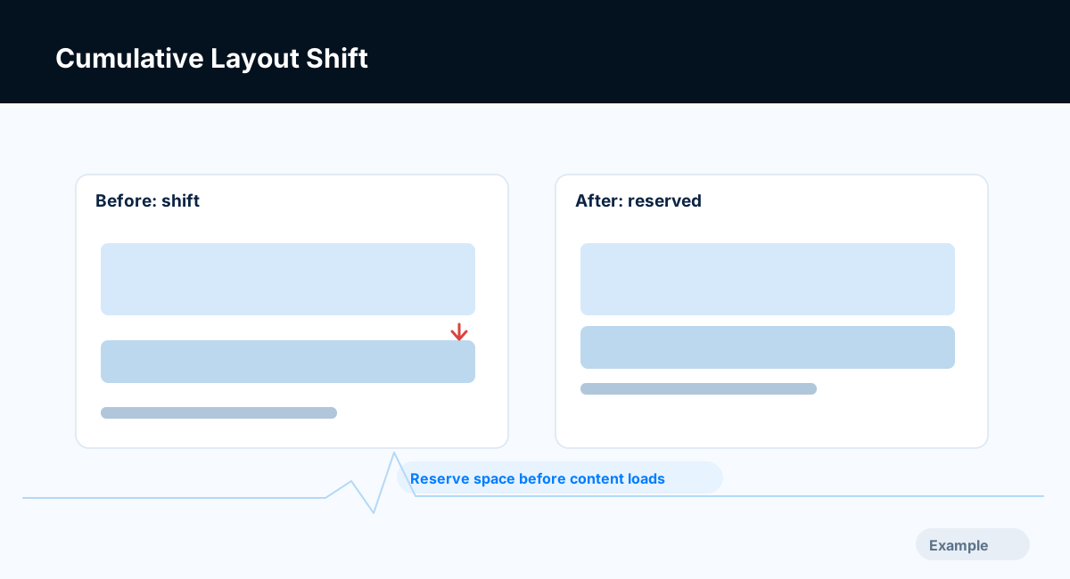
Example diagram, not a result from any real site.
Step-by-step instructions
Step 1: Reproduce the shift and name the culprit
Use a phone-sized viewport and a throttled connection so slow parts arrive late and the problem becomes visible.
- Open the page in Chrome, then open DevTools (F12, or Cmd+Option+I on Mac).
- Turn on device emulation and choose a phone-sized screen.
- Open the Performance panel, set network throttling such as Fast 4G, and record a reload. Stop once the page has settled.
- Look for layout shift markers. Depending on your Chrome version they appear as a Layout Shifts track or in the Insights sidebar. Select one to see its score and the elements that moved.
- Optionally open the Rendering tab (three-dot menu, More tools) and tick Layout Shift Regions. Shifted areas flash blue as you reload.
The Lighthouse report in DevTools also has an "Avoid large layout shifts" diagnostic that lists the biggest contributors. Lighthouse mostly observes the load, so Step 8 covers shifts that appear later.
Write down each element that moved and what pushed it. Typical answers are "hero image", "cookie banner", "ad slot", "embedded video" and "heading text after the font loaded".
What success looks like: a short list of the moving elements, in order of importance.
Step 2: Give every image and video a known size
Missing image dimensions are among the most common causes. With no size, the browser reserves no room, and the content below jumps when the file arrives. Give each image its intrinsic width and height as attributes; browsers use them to compute the aspect ratio before the download:
<img src="/img/team.webp" alt="The support team at a desk"
     width="1200" height="800" loading="lazy">
Keep the CSS responsive with max-width: 100%; height: auto;. The full treatment, including images in links and card grids, is in Image Layout Shift: How to Fix It with Width, Height and aspect-ratio, and Responsive Images with srcset and sizes covers keeping the ratio across versions. For video, reserve the box with CSS:
.video-frame { aspect-ratio: 16 / 9; width: 100%; }
Do not lazy-load the main image at the top of the page; it slows loading and does nothing for layout shift (Lazy Loading Images Without Hurting SEO). Make sure declared dimensions match the real file's ratio.
What success looks like: images appear inside boxes that were already their final size.
Step 3: Reserve a box for iframes and embeds
Maps, videos, social posts and payment widgets load from other servers, often late. Give the iframe a size or ratio, and wrap embeds of unpredictable height in a container with a sensible minimum height:
<div class="embed" style="aspect-ratio: 16 / 9">
  <iframe src="https://www.example.com/embed/abc" title="Product demo"
          width="560" height="315" loading="lazy"
          style="width:100%;height:100%;border:0"></iframe>
</div>
For variable widgets such as a social post, set the typical height as min-height. If the widget is taller the page still shifts, but only by the difference. Lazy-loading embeds below the first screen is fine once the box is reserved; see Lazy-Load Iframes and Video Embeds.
What success looks like: the embed's area is the same size before and after it loads.
Step 4: Reserve space for ads and late-loading slots
Ad slots and recommendation widgets fill after a network request, and the response may be one of several sizes.
- Give each slot a container with a fixed
min-heightmatching the most likely creative, present in the template from first paint. - Do not collapse the slot to zero when no ad arrives; that is itself a shift. Keep the space or show a quiet placeholder.
- Prefer slots below the first screen, where a late fill moves little that the visitor is looking at.
.ad-slot { min-height: 250px; width: 100%; contain: layout; }
The contain: layout line limits how far the slot's internals can affect other elements. Tags that inject content on their own schedule are a related source; Third-Party Scripts and Page Speed shows how to audit and defer them.
What success looks like: with the network throttled so the ad is slow, nothing around the slot moves when it fills.
Step 5: Handle banners, cookie notices and sticky bars
A notice that appears after load and pushes the page down is a classic offender. Use one of two approaches.
- Overlay, do not push. Place the banner with
position: fixedso it sits over the page and moves nothing. - Reserve its space from the start. If it belongs in the flow, build its box into the server-rendered HTML.
.cookie-notice { position: fixed; inset: auto 0 0 0; max-height: 40vh; }
Avoid injecting a banner above the header with JavaScript after the page has rendered. If a promotion must sit at the top, put it in the original HTML.
What success looks like: the banner arriving does not move the main content.
Step 6: Stop fonts from reflowing text
When a fallback font is swapped for the web font, lines can change length and the paragraphs below move. Font Display Swap: Load Web Fonts Without Layout Shift covers this in depth. In short:
- Preload the one or two font files used above the fold.
- Choose
font-displaydeliberately;optionalavoids swap shifts by using the web font only if it is ready in time. - Make the fallback match the web font's metrics:
@font-face {
  font-family: "Body Fallback";
  src: local("Arial");
  size-adjust: 104%;
  ascent-override: 92%;
  descent-override: 24%;
}
body { font-family: "Brand Sans", "Body Fallback", sans-serif; }
The percentages are placeholders. Measure your own font against the fallback before copying values.
What success looks like: when the font swaps, line breaks and heights barely change.
Step 7: Animate with transforms, not layout properties
Animating top, left, width, height or margin forces layout recalculation, and neighbours that move count as shift. Movement from transform does not change layout and is not counted.
.panel { transition: transform 0.3s; }
.panel.is-open { transform: translateY(8px); }
Replace sliding, growing and expanding effects with transform-based versions where the design allows.
What success looks like: menus and toasts do not move the content beside them.
Step 8: Control content that JavaScript inserts later
Some shifts appear only after the load: a related-posts block that renders when a script runs, a promotion injected after a delay, a list that grows as you scroll. Lab runs that stop at load may miss them; real visitors do not.
- Render the container in the HTML with a reserved height, then fill it.
- Add new items below the visible area, not above it.
- With long sections you skip rendering, pair
content-visibility: autowithcontain-intrinsic-sizeso the browser has a placeholder size. For infinite lists, see Infinite Scroll and SEO.
Browsers do not count a shift that begins within about half a second of a tap, click or key press, because the movement is expected. A panel that opens when someone presses a button is fine; one that opens by itself is not.
What success looks like: scrolling and waiting after load produce no unexpected movement.
Step 9: Retest in the lab, then confirm in field data
Repeat the Step 1 recording on every page type at mobile and desktop widths, and re-run Lighthouse on each template. Lab results are a fast test, not the verdict. The score Google uses comes from real visits, reported at the 75th percentile over a rolling period of about 28 days. After release, watch the field section of PageSpeed Insights and the Search Console report; see Field Data vs Lab Data and The Core Web Vitals Report in Search Console. Expect field data to improve over weeks, not hours.
Crawvix's scan includes a lab check, "Cumulative Layout Shift is good", which you can use as a before-and-after baseline.
What success looks like: each page type shows lower layout shift in the lab, and field data follows once enough visitors have used the updated pages.
Troubleshooting
The lab score is zero but Search Console still reports Poor. Field data covers the whole visit, while many lab runs stop at load. Look for shifts from scrolling, late widgets, consent tools and interactions, and test with a real scroll and click-through.
One template is fixed but others still fail. Shifts live in templates, and Search Console groups similar URLs. Apply the fix in the shared layout, slot or component.
Reserving space left a large empty gap. The box is bigger than typical content. Lower the minimum height to the most common size; a small shift beats a large permanent blank.
The image looks stretched after adding width and height. The attributes do not match the file's real ratio. Use the actual pixel dimensions.
Text still jumps although the font is preloaded. Fallback and web font metrics probably differ. Apply the override descriptors or try font-display: optional.
Shifts happen only at one screen width. A banner, sidebar or image has different rules at that breakpoint. Record at each width you support.
A script you do not control causes it. Reserve its container, delay it until the visible content is stable, ask the provider for a fixed-size option, or remove it if it adds little.
Final verification checklist
You can name the elements that were moving and what pushed them.
Every image and video has dimensions or a CSS aspect-ratio.
Embeds, ads and late widgets sit inside containers with reserved space.
Banners overlay the page or exist in the first HTML.
Fonts are preloaded where needed and the fallback matches closely.
Animations use transform and opacity.
Each page type was retested on mobile and desktop widths.
Field data was checked after the release.
Common mistakes to avoid
Treating one page's score as proof every template is fixed.
Hiding banner space instead of managing when and where it is inserted.
Using a fixed height that clips real content on narrow screens.
Lazy-loading the main image at the top of the page.
Collapsing an empty ad slot, which moves everything below it.
Frequently asked questions
What is a good CLS?
A CLS of 0.1 or less is rated good, 0.1 to 0.25 needs improvement, and above 0.25 is poor. Google's guidance applies this at the 75th percentile of page loads.
Can a font cause CLS?
Yes. When a fallback font is replaced by the web font, text can change size and wrap, which moves the content below. Preloading, a suitable font-display value and a metric-matched fallback reduce this.
Do I have to set width and height on every image?
You should for any image in the page flow. The attributes let the browser reserve space before the file downloads. CSS background images are different, because CSS sizes the box that holds them.
Why is my CLS different in PageSpeed Insights and Lighthouse?
PageSpeed Insights shows field data from real Chrome users and a lab run from Lighthouse. The field figure covers the full visit and many devices, so it can be higher than a lab figure that stops after load.
Does fixing CLS improve my search ranking?
Core Web Vitals are one of the signals Google's ranking systems use, but relevance and content quality matter more, and no fix promises a change in position. A steadier page does reduce mis-taps for visitors.
How long until Search Console shows the improvement?
The report is built from about 28 days of field data, so it moves gradually. Use lab testing to confirm the fix at once and the report to confirm it with real visitors later.
Related guides
- What Is CLS in Core Web Vitals?
- Image Layout Shift: Width, Height and aspect-ratio
- Font Display Swap: Load Web Fonts Without Layout Shift
- Core Web Vitals Explained: LCP, INP and CLS Thresholds
- Improve Lighthouse Performance Without Breaking Your Website
- Fix Largest Contentful Paint (LCP) on Mobile
- Improve Interaction to Next Paint (INP) on JavaScript Sites
Official references
- https://web.dev/articles/cls
- https://web.dev/articles/optimize-cls
- https://developer.chrome.com/docs/devtools/performance
- https://developer.mozilla.org/en-US/docs/Web/CSS/aspect-ratio
- https://developer.mozilla.org/en-US/docs/Web/CSS/@font-face/size-adjust
- https://support.google.com/webmasters/answer/9205520
Next step: Try the free website sample. This guide provides technical information and does not promise rankings, a perfect Lighthouse score or index inclusion.