 Performance · 9 min read
Mobile Usability: Fix Viewport, Tap Targets and Readable Text
Set the viewport meta tag, size and space tap targets, stop horizontal scrolling and keep text readable and zoomable, with tests you can run on a phone.

Practical, step-by-step website launch and SEO health guides.
Showing 25 to 34 of 34 guides in Performance (page 2 of 2)
Performance · 9 min read
Set the viewport meta tag, size and space tap targets, stop horizontal scrolling and keep text readable and zoomable, with tests you can run on a phone.
Performance · 10 min read
Check that your mobile pages carry the same content, links, structured data and robots rules as desktop, and test them with Search Console and DevTools.
Performance · 10 min read
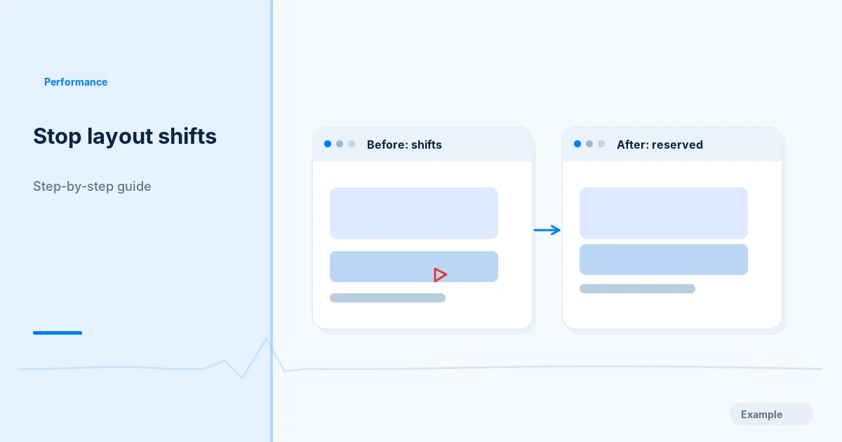
Find which elements make your page jump, then reserve space for images, embeds, ads, banners and fonts and retest CLS in the lab and in field data.
Performance · 10 min read
Find what fills your JavaScript bundle, remove unused code, split by route with dynamic import, and check the result with Lighthouse and DevTools.
Performance · 2 min read
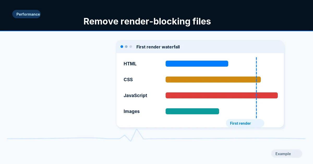
Identify the CSS and scripts that delay first paint, split critical from optional code, apply defer or async where safe and test menus and forms.
Performance · 11 min read
Write srcset and sizes correctly, use picture for art direction and formats, set width and height, and verify that phones download smaller files.
Performance · 9 min read
List every third-party tag, chat widget and ad script, measure what each costs your page, then remove, delay or isolate the ones that slow it down.
Performance · 10 min read
Measure time to first byte, split it into redirect, connection and server time, then cut each part with caching, fewer redirects and faster back-end work.
Performance · 2 min read
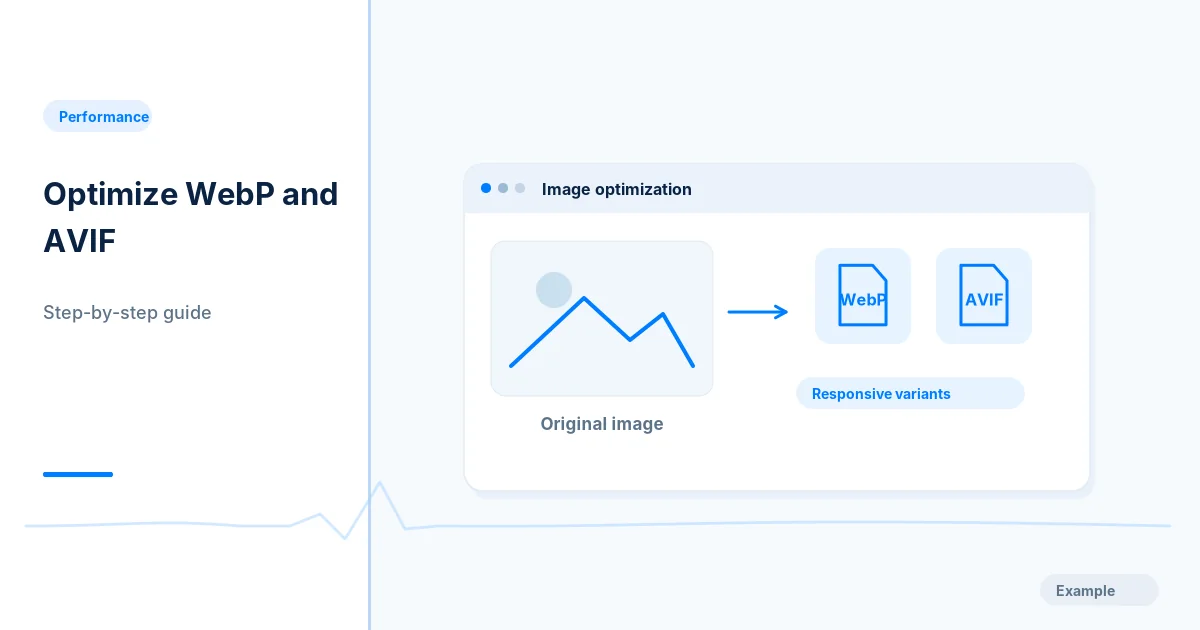
Audit your image sizes and formats, convert photos to WebP or AVIF, add responsive sizes and set loading attributes, then compare before and after bytes.
Performance · 10 min read
Learn what Cumulative Layout Shift measures, how it is scored, what counts as good, and how to read it in DevTools, PageSpeed Insights and Search Console.